Suggested Articles
Akvo Flow
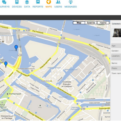
Flow is available as an Android application and a web based platform. Enables users to map situations on the ground to improve monitoring and evaluation of infrastructure and services, and...
Please sign-up or login
Flow is available as an Android application and a web based platform. Enables users to map situations on the ground to improve monitoring and evaluation of infrastructure and services, and...